Eddies Cove West
Age Structure Range
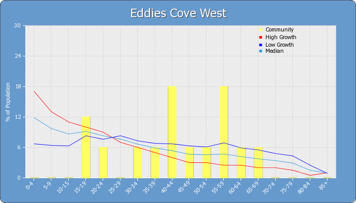
The age structure range graph is a re-formatted population pyramid and is displayed as a bar graph (yellow).
Age cohorts are on the bottom axis while the % population for each cohort is on the left axis.
The lines on the graph represent 3 separate demographic scenarios.
The "red line" represents high population growth with high birth and death rates common in many developing countries.
The "median" (light blue) growth line represents a growth scenario with high birth rates and increasing longevity
while the "low growth" (dark blue) line represents decreasing birth rates and increasing longevity and is a characteristic of many industrialized countries.
Generally, populations exhibiting low growth scenarios will eventually have issues with aging populations and maintaining existing labour forces.
Ideally, a demographic structure that is somewhere between the low and median growth lines represent a sustainable population.
If a demographic structure falls below the slow growth line that population is in decline and immigration may be the only means to sustain that population at its current level.
Score: Low Growth
More on Age Structure
The suggestions for viewing the age structure graphs are just a guideline and the user should be aware that many people are having children later in life (i.e. mid to late 30s).
A proper interpretation of these trends should take into account the local demographics, fertility and death rates etc.
Use the link to the Statistics Canada Demographic web page to get more information about demographics http://www.statcan.gc.ca/pub/91-003-x/91-003-x2007001-eng.htm .
The interpretation of the age structure range graph should focus on the 0-4 to 15-19 cohorts and the 25-29 to 60-64 + cohorts.
In most cases, except for urban areas the 20-24 cohorts represents youth who generally move away from smaller communities for post secondary education opportunities that are not available in smaller communities.
If these cohorts return to their respective communities’ one should see an increase in the 25-29 or 30-34 cohorts.
For example, if the 0-4 to 15-19 cohorts are below the slow growth line and the older cohorts (i.e. 40-44 to 60-64 cohorts) are above the slow growth line it would indicate a decreasing birth rate and aging population.
This trend would be interpreted as a potentially declining population.